
For many aspiring investors, a stock chart can look like a confusing jumble of lines, bars, and numbers. Yet, for seasoned traders and savvy investors, these charts are powerful visual representations of a company’s past performance and, crucially, a window into potential future price movements. Reading stock charts is a fundamental skill in technical analysis, a methodology that seeks to forecast future price action based on past price movements and trading volume.
While fundamental analysis focuses on a company’s financial health and intrinsic value, technical analysis focuses purely on market action. You don’t need to be a professional analyst to glean valuable insights from a stock chart. This guide will break down the essential components of a stock chart and introduce you to the basic principles of how to interpret them, helping you “read” the market’s story like a pro.
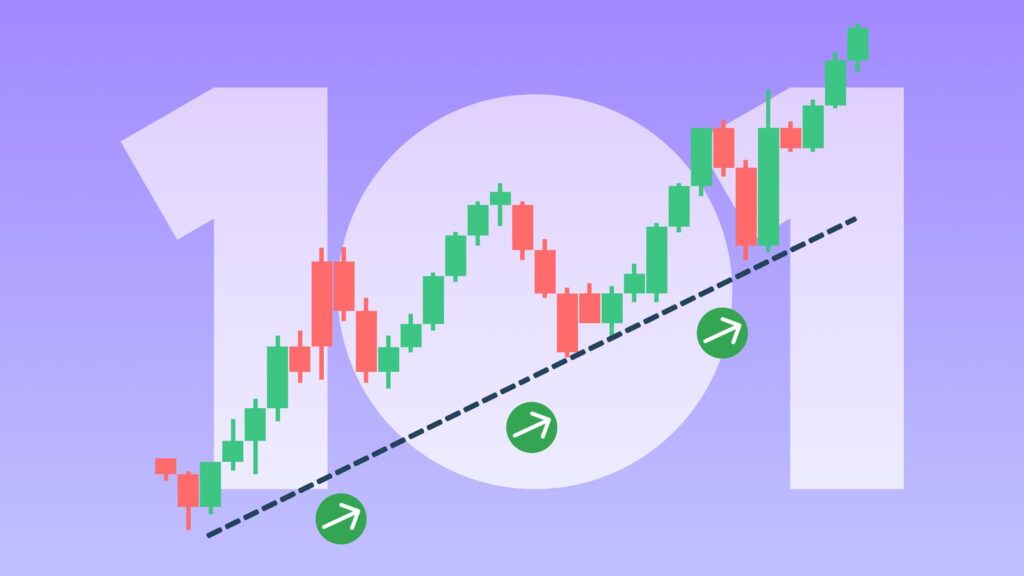
1. The Anatomy of a Stock Chart: Candlesticks Are Your Best Friend
Most modern stock charts use candlesticks (or bars) to represent price action over a specific period (e.g., one day, one hour, one minute). Each candlestick tells a four-part story about that period:
- Open Price: The price at which the asset first traded during the period.
- Close Price: The price at which the asset last traded during the period.
- High Price: The highest price the asset reached during the period.
- Low Price: The lowest price the asset reached during the period.
Understanding the Candlestick Body and Wicks (Shadows):
- The Body: The thick part of the candlestick represents the range between the open and close prices.
- Green/White Body (Bullish): The close price was higher than the open price. This indicates that buyers were in control during that period, pushing the price up.
- Red/Black Body (Bearish): The close price was lower than the open price. This indicates that sellers were in control, pushing the price down.
- The Wicks/Shadows: The thin lines extending above and below the body.
- Upper Wick: Represents the highest price reached during the period, above the body.
- Lower Wick: Represents the lowest price reached during the period, below the body.
Example: A long green body with a short upper wick and no lower wick suggests strong buying pressure, with the price opening low and closing near its high for the period. A long red body with long wicks on both sides indicates significant volatility within the period, but ultimately, sellers won out.
2. Timeframes: Zooming In and Out
Stock charts are incredibly flexible. You can view price action over different timeframes:
- Short-term: 1-minute, 5-minute, 15-minute, 1-hour charts (favored by day traders).
- Medium-term: Daily (D), Weekly (W) charts (common for swing traders and active investors).
- Long-term: Monthly (M), Quarterly (Q), Yearly (Y) charts (essential for long-term investors to identify overall trends).
Importance: Different timeframes provide different perspectives. A stock might look bullish on a 5-minute chart but bearish on a daily chart. Always start with a longer timeframe (e.g., daily or weekly) to understand the overall trend before zooming in to shorter timeframes for specific entry/exit points.
3. Volume: The Fuel Behind Price Action
Beneath the price chart, you’ll almost always see a series of vertical bars representing trading volume. Volume indicates the number of shares (or contracts) traded during that specific period.
- High Volume: Suggests strong conviction behind the price movement. If a stock surges on high volume, it indicates strong buying interest. If it drops sharply on high volume, it signals strong selling pressure.
- Low Volume: Suggests a lack of conviction. Price movements on low volume are less reliable and can be easily reversed.
- Rising Volume with Rising Prices: Confirms an uptrend.
- Rising Volume with Falling Prices: Confirms a downtrend.
- Falling Volume during a Trend: Can signal that the trend is losing momentum and might reverse.
Key takeaway: Price tells you what happened; volume tells you how many people agreed (or disagreed) with that price. Always analyze price movements in conjunction with volume.
4. Support and Resistance: The Price Boundaries
Support and resistance levels are fundamental concepts in technical analysis, representing price levels where buying or selling pressure is expected to be strong enough to temporarily halt or reverse a trend.
- Support: A price level where buying interest is strong enough to prevent the price from falling further. It’s like a “floor” where buyers typically step in. When a stock approaches support, you might see buying pressure.
- Resistance: A price level where selling interest is strong enough to prevent the price from rising higher. It’s like a “ceiling” where sellers typically step in. When a stock approaches resistance, you might see selling pressure.
How to Identify: Look for areas on the chart where the price has repeatedly stopped falling (support) or stopped rising (resistance) in the past. These levels often become psychological barriers for investors.
Breakouts: When a price breaks significantly above a resistance level (a “breakout”) or below a support level (a “breakdown”), it can signal a new trend or a continuation of an existing one with increased momentum.
5. Trends: The Direction of the Market
Identifying the prevailing trend is arguably the most important skill in chart reading.
- Uptrend (Bullish Trend): Characterized by a series of higher highs and higher lows. The stock’s price is generally moving upwards over time.
- Downtrend (Bearish Trend): Characterized by a series of lower highs and lower lows. The stock’s price is generally moving downwards over time.
- Sideways/Consolidation Trend: The stock price is trading within a relatively narrow range, without a clear upward or downward direction. This often occurs before a new trend emerges.
Trendlines: You can draw lines on a chart connecting the highs or lows to visualize trends. An upward-sloping line connecting the lows indicates an uptrend; a downward-sloping line connecting the highs indicates a downtrend.
Key takeaway: The common adage in technical analysis is “the trend is your friend.” It’s generally easier and less risky to trade with the prevailing trend than against it.
6. Common Chart Patterns (A Brief Introduction)
Beyond individual candlesticks and trends, prices often form recurring patterns that can signal potential reversals or continuations.
- Head and Shoulders: A classic reversal pattern, often indicating a shift from an uptrend to a downtrend (or inverse for a downtrend reversal).
- Double Top/Bottom: Reversal patterns indicating that a price has failed to break a resistance/support level twice, suggesting an impending reversal.
- Triangles (Ascending, Descending, Symmetrical): Consolidation patterns that often precede a strong price move in the direction of the breakout.
- Flags and Pennants: Short-term continuation patterns that signal a brief pause in a strong trend before it resumes.
These patterns require practice to identify accurately, but they offer valuable clues about market psychology.
7. Moving Averages: Smoothing Out the Noise
Moving averages are popular technical indicators that smooth out price data to create a continuously updated average price over a specific period. They help identify trends and potential support/resistance.
- Simple Moving Average (SMA): The average price over a set number of periods (e.g., 50-day SMA, 200-day SMA).
- Exponential Moving Average (EMA): Gives more weight to recent prices, making it more responsive to new information.
How to Use Them:
- Trend Identification: If the current price is above a moving average, it suggests an uptrend. If below, a downtrend.
- Support/Resistance: Moving averages can act as dynamic support or resistance levels.
- Crossovers: When a shorter-term moving average crosses above a longer-term moving average (e.g., 50-day SMA crosses above 200-day SMA), it’s often seen as a bullish signal (“Golden Cross”). The opposite is a bearish signal (“Death Cross”).
Conclusion: Practice Makes Perfect
Reading stock charts is a skill that develops with practice. You won’t become a “pro” overnight, but by consistently observing charts, understanding candlestick patterns, analyzing volume, identifying support and resistance, and recognizing trends, you’ll begin to decipher the market’s language.
Remember, technical analysis is not foolproof, and past performance is not indicative of future results. It’s a tool to complement your fundamental analysis and risk management strategy, not replace them. However, by learning to read stock charts, you gain a powerful visual aid that can enhance your understanding of market dynamics, help you make more informed decisions, and ultimately, navigate your investment journey with greater confidence.