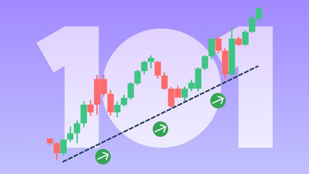
In the world of investing, stock charts are the primary language of the market. While fundamental analysis tells you what to buy, technical analysis—the study of price charts—tells you when to buy. For many beginners, looking at a stock chart for the first time can feel like staring at a complex EKG. However, once you understand the basic components, these visual tools transform into a roadmap for market sentiment and future price possibilities.
This guide will break down the essential elements of reading stock charts, from the anatomy of a price candle to identifying the powerful patterns used by professional traders.
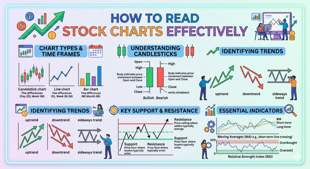
1. Choosing Your Visualization: Line vs. Candlestick
The first step in reading a chart is choosing how you want the data displayed. While there are several types, two dominate the industry:
- Line Charts: These are the simplest form. They connect only the closing prices over a set period. They are excellent for identifying long-term trends and “big picture” movements without the distraction of intraday volatility.
- Candlestick Charts: Used by the majority of traders, candlesticks provide four data points for every time period: the Open, High, Low, and Close (OHLC). This gives you a much deeper look into the “battle” between buyers and sellers.
Anatomy of a Candlestick
A candlestick consists of a body and wicks (or shadows).
- The Body: Represents the range between the opening and closing prices. If the candle is green (or white), the stock closed higher than it opened. If red (or black), it closed lower.
- The Wicks: The thin lines sticking out of the top and bottom show the highest and lowest prices reached during that timeframe.
2. Understanding Timeframes
A chart’s “timeframe” dictates what each data point represents.
- Intraday (1-min, 5-min, 15-min): Used by day traders to spot quick fluctuations.
- Daily: Each candle represents one full trading day. This is the gold standard for most investors and swing traders.
- Weekly/Monthly: Used to identify multi-year trends and major levels of historical significance.
Pro Tip: Always start with a higher timeframe (Daily or Weekly) to find the overall trend before “zooming in” to lower timeframes for an entry point.
3. The Pillars of Technical Analysis: Trend, Support, and Resistance
Before applying complex indicators, you must master the “Big Three” of chart reading.
Identifying the Trend
The market moves in three directions: Uptrend, Downtrend, or Sideways (Ranging).
- Uptrend: Characterized by “Higher Highs” and “Higher Lows.”
- Downtrend: Characterized by “Lower Highs” and “Lower Lows.”
- Sideways: Price is “trapped” between a specific ceiling and floor.
Support and Resistance
Think of Support as a floor where buyers usually step in to prevent the price from falling further. Resistance is a ceiling where sellers typically outweigh buyers, stopping the price from rising.
The Principle of Role Reversal: Once a resistance level is broken, it often flips and becomes a new support level.
4. Using Technical Indicators for Confirmation
Indicators are mathematical calculations based on price or volume. They shouldn’t be used in isolation but rather to confirm what the price action is already telling you.
| Indicator | Purpose | How to Read It |
| Moving Averages (MA) | Smooths out price noise | When the price is above the 200-day MA, the long-term trend is considered bullish. |
| Relative Strength Index (RSI) | Measures momentum | Readings above 70 suggest “Overbought” (potential drop); below 30 suggest “Oversold” (potential bounce). |
| Volume | Shows strength of a move | A price breakout accompanied by high volume is far more reliable than one on low volume. |
5. Identifying Profitable Chart Patterns
Patterns are visual representations of human psychology—fear and greed repeating themselves over decades. Here are three you should know:
The Head and Shoulders (Reversal Pattern)
This signals the end of an uptrend. It looks like three peaks: a tall peak (the head) flanked by two smaller peaks (the shoulders). When the price drops below the “neckline,” a downtrend often follows.
The Cup and Handle (Continuation Pattern)
This looks like a tea cup in profile. It signals a period of consolidation followed by a breakout to the upside. It is one of the most reliable “bullish” patterns for long-term growth.
Double Top / Double Bottom
A Double Top looks like the letter “M” and indicates the price has failed twice to break a resistance level, signaling a potential drop. A Double Bottom looks like a “W” and suggests a potential rally.
6. Common Mistakes to Avoid
- Over-complicating Charts: Beginners often add 10 different indicators. This leads to “Analysis Paralysis.” Keep it simple: Price, Volume, and one or two indicators.
- Ignoring the Broader Market: A great stock chart can still fail if the overall market (S&P 500 or Nasdaq) is in a steep decline.
- Chasing Parabolic Moves: If a stock chart shows a vertical “moon shot,” it is usually too late to enter. Wait for a “pullback” to a support level.
Summary: Your Step-by-Step Checklist
To read a stock chart effectively, follow this sequence every time you open a new ticker:
- Check the Trend: Is it moving up, down, or sideways on the Daily chart?
- Mark Levels: Where are the nearest Support and Resistance lines?
- Analyze Volume: Is the recent move supported by high trading activity?
- Look for Patterns: Is there a recognizable shape (Flag, Triangle, W) forming?
- Confirm with Indicators: Does the RSI or Moving Average support your thesis?
Reading stock charts is a skill that rewards patience. By focusing on the relationship between price and volume rather than searching for “magic” signals, you will develop a much clearer view of where the smart money is moving.
Are you interested in learning more about a specific indicator, such as how to use the MACD or Bollinger Bands to refine your entry points?